Los Angeles Premiere Nov 16th

Posted by Jake on November 4, 2017

The Los Angeles Premiere of App: The Human Story comes to the beautiful Art Theatre in Long Beach's historic Retro Row, Thursday, Nov 16th, at 7:30 pm.

This feature length documentary gives a voice to the passionate community of indie app developers. App: The Human Story is a look at the coming of age of an all new art form.

With the launch of the iPhone and subsequent devices, developers found themselves with a worldwide market hungry for their innovations: apps.

Yet, a renaissance needs cultivation, not exploitation. Ten years in, is the opportunity gone? Will artists find a way to create tools that elevate the human experience, or will the market be valued even above the impact to the future of the industry?

Tickets are $10 and available at the door and online. Backers who purchased premiere tickets during the film's Kickstarter campaign are encouraged to RSVP via email to co@storyandpixel.com. They will enjoy VIP seating and are invited to a pre-screening mixer with complimentary drinks at 7 pm to meet the attending cast and crew.

Many cast and crew of the film will be in attendance and there will be a Q&A panel after the film.

For parents considering bringing their children, please be aware there is some infrequent swearing in the film.

Twin Falls Premiere Nov 5th

Posted by Jake on October 30, 2017

The Hometown Premiere of App: The Human Story comes to the Orpheum Theatre, Sunday, Nov 5th, at 7 pm.

This feature length documentary gives a voice to the passionate community of indie app developers. App: The Human Story is a look at the coming of age of an all new art form.

With the launch of the iPhone and subsequent devices, developers found themselves with a worldwide market hungry for their innovations: apps.

Yet, a renaissance needs cultivation, not exploitation. Ten years in, is the opportunity gone? Will artists find a way to create tools that elevate the human experience, or will the market be valued even above the impact to the future of the industry?

The concept for the film was conceived in Twin Falls in 2012 while the original directors both resided there. For parents considering bringing their children, please be aware there is some infrequent swearing in the film.

Tickets are $10 and available at the door and online. Backers who purchased premiere tickets during the film's Kickstarter campaign are encouraged to RSVP via email to co@storyandpixel.com. They will enjoy VIP seating and complimentary drinks at the after party.

The film's director, Jake Schumacher, will be in attendance and there will be a short Q&A after the film.

Jake & Jed's Renderbeast

Posted by Chris Stevens of JLOOP on September 30, 2016

Special thanks to Chris Stevens of JLOOP for designing the editing rigs and for contributing this post.

The boys at Story & Pixel have been editing on Adobe Premiere using 2013 Mac Pros (the notorious "trash can" model, quad core) using an external RAID (a Drobo unit with 5 mechanical drives in a RAID 5 configuration, connected via USB 3.0). On the surface, this seems like it would be a solid choice for a rendering rig, what with its Xeons and FirePros, and whatnot, but it turns out that it falls a bit short in the performance department, particularly when it comes to editing in Premiere, and it's especially disappointing considering the financial cost. Since the boys are all-in on completing a feature-length film, time (and therefore computing power) is of the essence.

While all of us enjoy Apple products, especially the excellent operating systems they run, trying to buy a Mac Pro that can give you the most out of Premiere is something of a losing proposition, even when money is no object. While high end Macintoshes have always been disproportionately expensive compared to their PC counterparts, most of the blame here lies with Adobe and the way they've done optimization (or lack thereof) in Premiere. Because Premiere benefits from some fairly specific components, we went down the path of hand-building a custom PC. While we built ours by hand, there are multiple reputable and affordable vendors out there that will allow you to customize nearly every part of a pre-built PC, too.

When it comes to rendering video, the traditional theory is that more cores == more performance. And, in fact, most other mainstream editing suites such as Sony Vegas or Final Cut Pro benefit greatly from higher core counts. This seems to make sense since video rendering is an easily parallelizable task: one core can work on one frame, while another works on the next, etc. However, for reasons that we don't fully understand, Premiere benefits much more from outright clock speed (GHz). Our initial plan for a new machine was to build an absolute monster using a twin-socket motherboard and older model Xeons (a steal of a deal at ~$90/ea), that would've given us 16 cores and 32 threads (with Hyperthreading), but at the very last minute, a random YouTube video surfaced in the recommendations sidebar that showed a gentleman doing a direct comparison between the very same Xeons and a single quad-core Skylake i7 6700k. The i7 was miles ahead, and so we switched gears and based our build around the i7.

The other interesting optimization issue with Premiere is that for GPU-based tasks, it performs much better using nVidia's CUDA vs. OpenCL on AMD. While the dual workstation-grade AMD FirePros in the Mac Pro would normally be considered strong performers for most tasks, it turns out that they can't reach their full potential within the confines of Premiere—a single, inexpensive "gaming"-grade GPU from nVidia can wipe the floor with them, and Apple doesn't provide an nVidia option for the Mac Pro at this time.

The final issue we faced was with the Drobo. It's an excellent general-purpose storage appliance that is very easy to configure and use, and is extremely reliable, but it isn't designed for outright performance. Specifically, there is no flexibility on the RAID level. It uses RAID 5, which is a reasonable balance between performance and reliability, but we needed to tilt the scales much further in favor of performance. We already had multiple redundant backups, and didn't need that extra level of assurance and uptime that RAID 5 redundancy provides.

Enter the Renderbeast.

The Renderbeast was designed to play to Premier's strengths and eliminate the poor disk performance of the Drobo. Here is a link to our list of parts (excluding hard disks).

The quad-core Core i7 6700k is the heart of this machine. As of this writing, at 4.0 GHz, it's the highest clocked Intel processor available. What's more is that if you're slightly brave, it will easily overclock to 4.4-4.5 GHz with a modest air cooling solution like the 212 EVO that we chose. While Intel makes similar i7's with higher core counts for a bit more money, they do so at the sacrifice of clock speed, which goes against what Premiere desires. If you're in a situation where you need to run additional heavy apps alongside Premiere, it may be worth investing in the 6- or 8-core models.

The MSI Z170-based Gaming M5 motherboard was chosen for being reasonably priced while also providing a strong set of features. Among other things, it supports nVidia's SLI, which will allow us to add a second video card if we feel we need it (right now, things are just great with one). Most full-sized Z170-based motherboards from the likes of ASUS, Gigabyte, or other reputable vendors will have nearly identical features.

We outfitted the machine with 64 GB of RAM since that's the maximum amount that the motherboard can support. Video editing software will almost always make use of any memory it can, and since RAM is cheap, it made sense to max it out.

For the GPU, we went with the GeFore GTX 1070. We were fairly lucky to be doing this build right as nVidia's 1000-series released. The 1070 is just a tiny step down in performance from the top-of-the-line 1080, but at a much better price point ($500 vs. $850 as of this writing). With 1920 CUDA cores, this really helps Premiere fly during GPU-based rendering.

Storage configuration required a bit more thinking than a "normal" PC would require. We've used the motherboard's RAID controller to configure 4 7.2k mechanical hard drives into RAID 0 for storing the Premiere project files and video clips. If you're unfamiliar with RAID levels (of which there are many), RAID 0 splits files across all disks, and provides no redundancy, while RAID 5 makes partial copies of each disk and breaks them out across the others. Our RAID 0 does ~500 MB/s-700 MB/s depending on how full the drives are. Imagine putting a 12 TB SSD into your machine, and that's about the performance level you can expect, but you'll be paying an order of magnitude less per gigabyte. The operating system and applications are on a separate 500 GB SSD (nothing special, just one of the inexpensive 2.5" SATA drives that are common these days). Finally, there is another separate 256 GB SSD for Premiere's "scratch" drive. We waffled a bit about how large this should be, but ultimately, this ended up working well.

Ultimately, the Story & Pixel boys are sad to have left Apple behind for their editing rigs. A few details of their workflow had to be re-learned, but the benefits far outweighed the costs, both financial and technical. We hope that Apple will give the Mac Pro an overhaul some day soon, and possibly provide more configuration choices, but since they're notoriously secretive, we don't know what the future holds. Even more so, we'd hope that Adobe can find a way to optimize Premiere to better accommodate other common hardware configurations, and make better use of the high core counts that many machines sport these days.

KS Update - Nearing completion. Looking for help with finishing costs.

Posted by Jed & Jake on July 19, 2016

KS Update - Subtitles now available for rough cut

Posted by Jed & Jake on July 5, 2016

KS Update - Wrapping up June

Posted by Jed & Jake on June 29, 2016

KS Update - Counting down to June

Posted by Jed & Jake on May 23, 2016

The App Behind App - Part 3

Posted by Jake on April 22, 2016

This is the last of a three-part series about our app, Quantify, that we created to help us make our first feature documentary. This behind-the-scenes is possible by a partnership with the great people at UserTesting.

*To catch up and to get more insight into the app, check out our first and second posts.

Quantify is launched!

Jake and our developer, Ryan Newsome, flew to Vegas this last Tuesday for the afternoon to talk to editors and shooters at NAB about Quantify.

Last week, our little filmmaking app, Quantify, launched!

What started as a lark is now a polished 1.0 that we are so proud of. Launching our own app that is already saving other filmmakers hours is a great feeling. When we consider what our 1.0 might have looked like if we had never done UserTesting, we can't help but cringe.

Full disclosure: UserTesting is one of our great sponsors for App (June, baby!), and they loved the meta story of our app, so they sponsored us to bring you a little peek behind the curtain as Quantify was brought to life. We're incredibly grateful for this opportunity as their sponsorship funded the production of App for a season when things were tight, we got to use their great services for Quantify, and we could write whatever we wanted, good or bad.

As you know by now, our MO at Story & Pixel is very DIY, community funded, bootstrapped, or a mix of the two. We take pride in doing a lot with a little and, in that spirit, we, sadly, probably would have never considered UserTesting. Most likely, we would have written it off as something we could accomplish in our beta. Luckily for us, we had an opportunity to try out UserTesting and our app is better for it.

Standing where we are now, we see user testing as a necessary step in the development process, but it's not something you can realistically pull off well yourself. It's near impossible to find unbiased strangers who are willing to test your app and tell you to your face that it's shit. With UserTesting, we could write a test that was exclusive to full-time video professionals with deep experience with specific software and we would have candid video tests back within an hour.

  • UserTesting saved our developer a ton of time. We were able to fully understand problems before offering development ideas.
  • UserTesting exposed stumbling blocks that were confusing users. Quantify may be a simple app to use, but until we figured out how to clearly communicate the big idea, even seasoned filmmakers struggled to fully grasp the power of the app. Not only did uncovering this help us make the app better, it also informed our marketing in a profound way.
  • UserTesting was essential in streamlining the workflow of the app and testers gave us great ideas for alternate workflows and even new features!

Quantify's Onboarding Video

Quantify's New News Reader

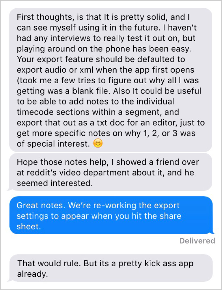
Tooltip to explain ratings

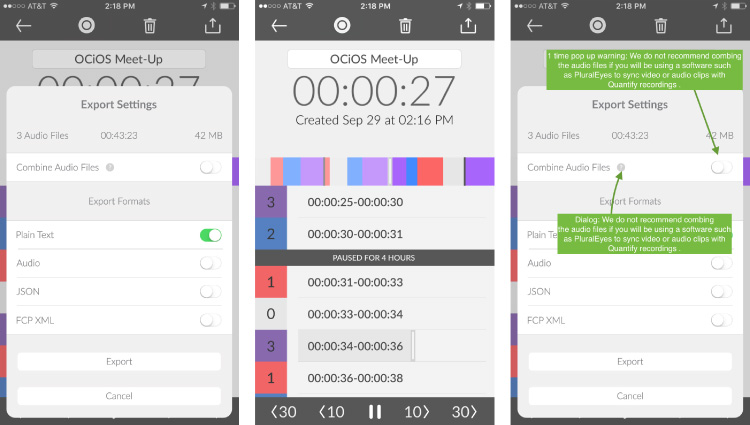
Some changes to the app from our most recent rounds of testing

Take Away?

Knowing what we know now, the price for testing wouldn't deter us. Our first test with three users would have run us ~$150 at the introductory rate. Even if they were full price, the test results easily paid for themselves with the time and effort we saved, especially for our developer who is doing 90% of the work. We would recommend, at a minimum, running tests (even small ones) at three points:

  1. When you have your first working build
  2. In the middle of the project after implementing changes
  3. At the end while polishing the app.

We barely scratched the surface of what UserTesting has to offer. They have an ever expanding menu of services, great support, and a truly rich and vibrant culture that we were able to witness first hand while visiting their Mountain View office.

p.s. If you're interested, here are the full UserTesting videos we received this round. Enjoy!

Thanks for reading. Please check out the store if you are interested in watching the film.

KS Update - June

Posted by Jed & Jake on April 12, 2016

The App Behind App - Part 2

Posted by Jake on February 15, 2016

This is the second part of a three-part series about our app Quantify that we created to help us make our first feature documentary. This behind-the-scenes is possible by a partnership with the great people at UserTesting.

*To catch up and to get more insight into the app, check out our last post.

Progress

Just a few weeks ago, our developer Ryan Newsome got us to the point of releasing our first public beta. This was a big step and was super exciting, as we decided to fundamentally re-work Quantify back in October, and it was great to finally be able to interact with our new UI paradigms.

We rolled out the beta to about 25 people—or at least we thought we did. As most of you know, beta testing apps for iOS is not for the faint of heart. We had a miss-fired launch that left some testers with an excited email about the beta, but no build on their device. We realized it after a few quiet days, but it's hard to believe that we're 8 years into the launch of the App store and the process is still this brutal.

So far, about 10 of our testers have installed and launched the app. We feel like we're up and running now. One key thing that we've noticed with our beta testers is that although they really like the app, getting feedback from them only happens when we hit them up individually and we're still trying to get a film out the door that we can be proud of.

Text from Wes

So that was our dilemma. Our beta testers have really great insights but it's going to take some amount of time to get those insights from them. We're short on time and really wanting to move the app forward because there is a good chance it might be our best bet at keeping food on the table as we continue to edit the film.

UserTesting Saves the Day

With no time and in need of feedback to move Quantify forward we put up a 3 person test on UserTesting last night. Our test was limited to people who shoot or edit video as part of their profession, so it was a very niche tester we needed...and within an hour we had our first completed test. Within the second hour we had our 2nd and 3rd test!

This morning we reviewed the tests and were able to get some modified design images to Ryan so he can start implementing them while we get back to work.

Design updates

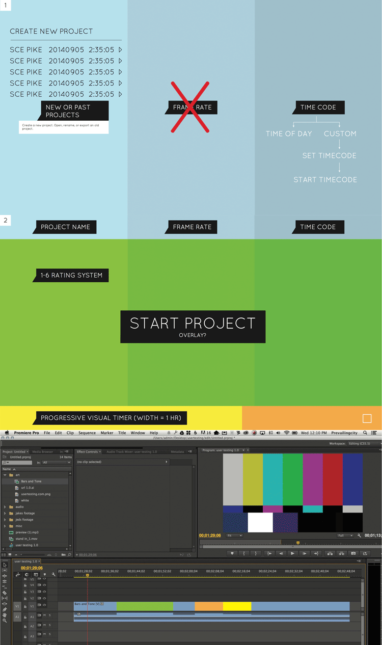
Some of the changes coming to the app because of testing

After reading our last post, Marc Edwards from Bjango (and the designer of Quantify) mentioned that we should consider Quantify'ing the next set of user videos. We loved the idea, but when we went to do this we came across some rad features already built into UserTesting.

One other feature we came across was the ability to save favorite testers. This guy DarkBulb did such a great job for us that we definitely want him involved in future builds. Check out his highlight reel below. Also, we had a video professional who wasn't quite convinced. We want to revisit with him when we're closer to launch to see if he can catch the vision of Quantify saving him hours a week.

Our big take away from this round of testing was the need for context within the app. In the App Store, and in our marketing, we can supply a lot of context for what Quantify does, but we've discovered that it's key to make that context abundantly clear in the app as well. People don't tolerate needing to put a lot of discovery into a new app, so helping them quickly catch the vision of Quantify saving them lots of hours is essential to creating regular users.

Quick Tip

Tip for making tests: keep tasks super simple and concise. We've understandably confused some testers with long questions.

Thanks for reading. Please check out the store if you are interested in watching the film.

The App Behind App - Part 1

Posted by Jake on December 29, 2015

If you've been following the progress of the film to any degree, there is a chance you've heard us mention that we made a little tool to help with the filmmaking process. One of our sponsors, UserTesting, loved the idea that the filmmakers behind a doc about apps were discovering what it took to create an app themselves. So they teamed up with us to bring you a little of the behind the scenes journey of the app behind App.

Quantify - Rate Time in Realtime

One of the fun things about working on a film about apps and their creators is that you're constantly reminded of the possibilities afforded when, in your pocket, is a tool that can be shaped into almost any other tool. Pair that with one of software's most endearing qualities—if you solve a problem for yourself, your work can solve it for others—and we couldn't resist making Quantify (what we're calling our little app).

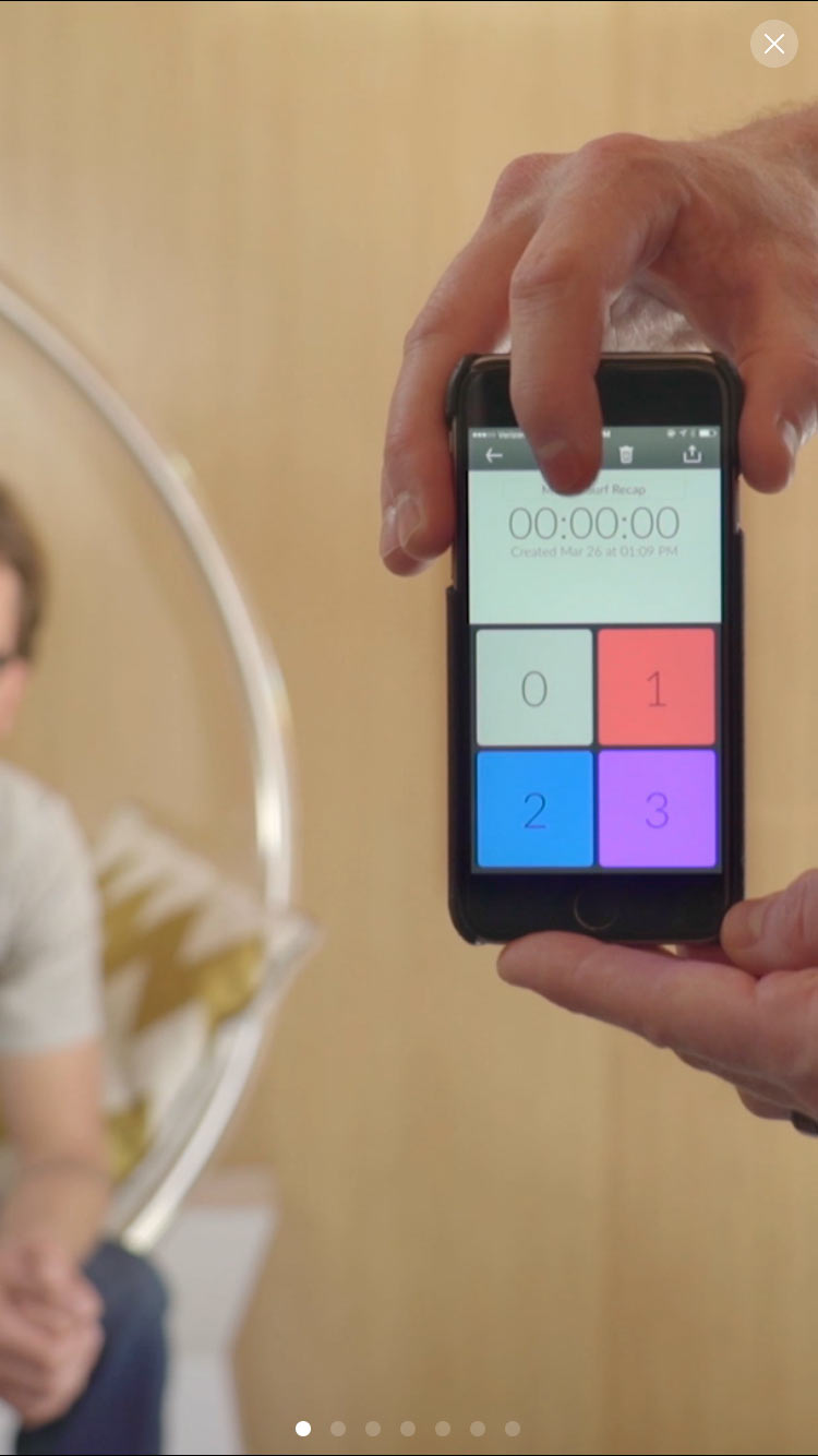
Quantify, put simply, lets us rate time in realtime.

Quantify Timeline

As most app ideas do, Quantify came from a problem. As we began shooting interviews, we quickly realized that some simple timestamp data could save us a ton of time, if only we could capture it. We made a quick mockup and ran the idea by our friend, Ryan Newsome, who took a quick look and sent us a working beta after just a few hours of development.

Quantify Early Mockup

We used this tool (long before it was called Quantify) to shoot many of the 46 interviews we've shot for the film. We used it while interviewing the immensely talented Marc Edwards. He noticed the app (in its terribly ugly, then prototype state) and offered to hook us up with a design. We did not turn him down.

Marc's design was everything you hope for in a great app: intuitive, elegant, and fun. With a new look, we could share this tool publicly without being embarrassed. We teamed up with Ryan again to bring the design to life, and Quantify was born.

Enter UserTesting

UserTesting invited us to use their testing service with the instructions "kick the tires, run tests, and share what you think, good or bad". Those were terms we could get behind, so we jumped on it.

UserTesting has thousands of testers that can be filtered down in all sorts of ways to reach your target market. Then you get videos of real people speaking their thoughts as they use your app. You can assign tasks and ask questions to see how easy it is to use your app, website, or prototype.

Though we had a lot of test credits available to us, we thought it might be a more valuable experiment if we approached the tests in the way an indie dev with little to no budget would. With that in mind, we started out with only three tests.

The process of setting up the tests was quick (around a half hour), and gave us a lot of freedom too.

The tests we got back were so insightful. They confirmed something we had been wondering about: adding voice recording. At the time, Quantify was a niche app designed for the needs of filmmakers. With voice recording, Quantify could become a useful tool to way more people.

At $49.99 a piece, these tests are not cheap, but contrast that with the value of the insight that we got back and it feels like a steal. Since we're not iOS developers, essentially we "paid" the equivalent of one hour of development time to get 45 minutes of real world insight from potential users; insight that fundamentally changed our product road map. We were stoked.

What's Next

While we spend our day-to-day moving App forward, Ryan is getting closer to releasing an updated build that we're going to take back and run more user tests on. We'll be sure to let you know how it goes.

Want to see Quantify evolve first-hand? Contact us to join the Quantify beta.

p.s. If you're interested, here are the full UserTesting videos we received. Enjoy!

Thanks for reading. Please check out the store if you are interested in watching the film.

T-Shirt Orders are Open for the Next Week

Posted by Jake & Jed on November 19, 2015

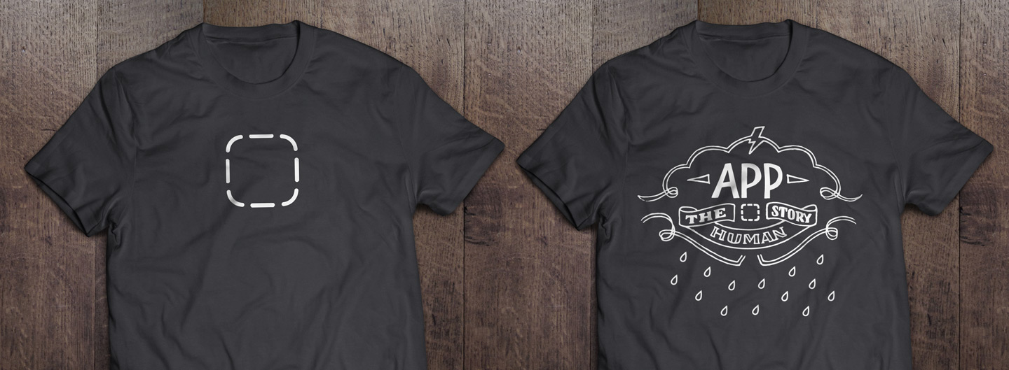
T-Shirt Designs

App t-shirt orders are now open for the next week (until midnight PST, Nov 26th)! We even updated our much loved Icon shirt. Visit our store to pick yours up.

Hint. Join our neglectfully infrequent mailing list for 15% off.

No spam, ever. Emails are never shared.

We're Missing Our Estimated Ship Date

Posted by Jake & Jed on November 17, 2015

Last summer, we set out to make something incredible for a community we care a lot about. It's been an amazing journey. Thanks to the support of over 2,000 backers and those of you who have made pre-orders, we have been able to work on the film full time since we funded, with only 5%-10% of our production time this last year going towards side projects to keep gas in the tank. We've discovered that learning in public and making a great feature-length documentary film are more difficult than we anticipated. We're getting there, though, and we are going to deliver something beyond what even we set out to make. It’s just taking a little more time than we thought. Go figure. We shared the news with our backers yesterday and the response has been so encouraging.

Moving forward, it looks like we're going to have 90 minutes cut by the end of the year, but it's going to be far from something we would want to show publicly. The feedback that we've heard from you regarding the level of thought and production we've been putting into the project has been incredibly energizing, as we see you're catching the vision for the quality of film we're going for.

So in order to do right by our backers, and the film and those in it, we are concentrating on making it the best it can be. Thank you for your patience and support.

Best,
Jake & Jed
@appdocu

p.s. If you've pre-ordered shirts with us, we're not going to wait to fulfill those. T-shirt orders are open for the next week and then they will ship out from our supplier.

p.p.s If you're a backer, please check your email or Kickstarter messages for a note from us with details on bonus rewards.

Here’s where the first cut of the edit was in September:

XOXO Rough Cut Online Premiere - Our First Crack at the Opening of App

Posted by Jake & Jed on November 8, 2015

Wow. It's time! It feels like a lifetime ago that we premiered the cut you're about to watch at XOXO Fest. What you're going to see is a rough cut of the first 12 or so minutes of the film + a short teaser at the end.

We're so grateful to those of you who have supported the film—especially over the last few months with your encouraging words and re-tweets of shorts. Last, but far from least, we'd like to thank super backer Gabriel Cubbage from AdBlock for jumping on as our Premiere Sponsor for the online release of this cut. Through these combined efforts, we have been able to keep our heads down, pushing the film forward.

Where We're Headed

Since the first computer, humanity has been fashioning digital tools to extend our capabilities and augment our reality. Thanks to these tools, mankind has surged forward in understanding of ourselves, the world, and what lies beyond.

In the early days of the personal computer—as developers realized they could wield a tool that could become almost any other tool—a pioneering spirit was born. Unrecognized by most, these developers were laying the groundwork for a worldwide phenomenon.

Flash forward to the release of the iPhone in 2007. It, along with subsequent devices, would be the catalyst for the bulk of humanity interacting with software on a daily basis, then an hourly basis, and finally a nearly constant basis.

Looking forward from here, we realize that we stand in the midst of a tide—risen beyond retreat. There is not a day in the foreseeable future where the majority will not have a computer always on us.

The true greatness of these devices is the apps: an endless catalog of incantations, capable of empowering with superpowers of productivity and connectivity, while equally capable of stealing attention and bringing isolation.

Each of us, as individuals, has become the unlikely voice in shaping software. It’s up to us to decide how beautiful this future will be. We do this with the software we create, the apps we buy or give our attention to, and the platforms we build for others. You know...no big deal.

So here, in its rough form, is the beginning of the story we’re wrestling to tell. As you will see we have a long way to go, but we’re not discouraged. It’s not where we start that defines the film, but where we finish.

Help us shape it into something we all can be proud of. We welcome your notes.

Enjoy!

Much love,
Jake & Jed
@appdocu

Cast (in order of appearance): John Gruber, Matías Duarte, Laura Savino, Adam Lisagor, Scott Snibbe, Windy Chien, Cabel Sasser, Neven Mrgan, Ish Shabazz, Heather Buletti, Jake Lodwick, Pasquale D'Silva, Jason Snell, Steven Frank, Björn Jeffery, Ken Wong, Steven Aquino, Ashley Nelson-Hornstein, Marco Arment, Sebastiaan de With, Denys Zhadanov, Igor Zhadanov, and Brent Simmons
Special thanks to: Our cast (you'll be seeing many more), Andy and Andy for having us at XOXO, our EP Adam Lisagor for awesome notes, our wives and kids who saw a lot less of us during this season, and everyone who has loaned us a couch or shared a drink with us while traveling.
Musical Score By: Enoch Kim

Thanks for reading. Please check out the store if you are interested in watching the film.

Sebastiaan de With on Coming Back to Design

Posted by Jake & Jed on October 30, 2015

Here it is, the last of our rollout of mini-shorts leading up to the release of the edit we showed at XOXO Fest. In this short, we picked a segment capturing a profound moment recounted by Sebastiaan de With.

Burnt out on the tech world, Sebastiaan escaped to Alaska on his bike to rethink everything. He's not alone in wondering if his digital contribution to the world has any real meaning. There is a profound joy and power that comes from being able to create from nothing but the space between your ears. Yet that joy is often contrasted by a nagging wonder. What is the real value of great digital design? Is it only noticed by a few or has the cultural revolution of apps inadvertently prompted everyday people to consider UI and UX and start to expect better experiences—even if only subconsciously?

Can the etherial world of painstakingly arranged bits have real effect or value on the world of atoms? These are the questions being asked and struggled with as we transition into the world of ever present bits.

We're really excited for you to see the XOXO edit and we're even more excited for you to see what will be the final film that we're grinding on everyday.

Again, please overlook the rough edges. We hope you love it.

Much love,
Jake & Jed
@appdocu

These shorts and the eventual release of the XOXO edit are all thanks to our release sponsor AdBlock, who has just recently rolled out their new mobile solution.

Video Credits:
Featuring: Sebastiaan de With
Featured App: Paper by Facebook
Musical Score By: Enoch Kim

Thanks for reading. Please check out the store if you are interested in watching the film.

Björn Jeffery, Ken Wong, and John Gruber on the Profundity of the Touch Interface

Posted by Jake & Jed on October 22, 2015

In continuing our rollout of mini-shorts for the next few weeks leading up to the early November release of the edit we showed at XOXO Fest, we chose a fun little clip about the profound importance of the touch interface. These shorts and the eventual release of the XOXO edit are all thanks to our release sponsor AdBlock, who has just recently rolled out their new mobile solution.

With the modern pace of tech news, it's easy to forget how fundamentally the touch interface has expanded the audience of who is interacting with apps on a daily basis. The widespread adoption of touch interfaces has moved the acquisition of and interaction with software from the exclusive realm of professionals and enthusiasts to the mainstream of pop culture.

In this short taken from our XOXO Fest edit, Björn Jeffery, the CEO of Toca Boca, Ken Wong, the designer of Monument Valley, and John Gruber, the proprietor of Daring Fireball, weigh in on what makes touch such an accessible interface—even for those who have never interacted with a computer before.

Also, a shout out to our friend Steven Aquino, the writer of a great accessibility blog, who is also featured in the short. We were able to get a short, last second interview with with Steven on one of our production trips and he's become a huge asset to the film, helping us fact check accessibility claims.

Again, please overlook the rough edges—the color grading and audio mixing stick out the most to us, but we're putting our energies towards moving the film forward. We hope you love it.

Much love,
Jake & Jed
@appdocu

Video Credits:
Featuring: Björn Jeffery, Ken Wong, John Gruber
Special Thanks: Steven Aquino, John Voorhees, Joe Rosensteel, Asana, Toca Boca, Pacific Helm (RIP)
Musical Score By: Enoch Kim

Thanks for reading. Please check out the store if you are interested in watching the film.

Jake Lodwick and Heather Buletti on How Apps Can Make Us Superhuman

Posted by Jake & Jed on October 16, 2015

Catching Up

If you missed it, we are rolling out a mini-short for the next few weeks leading up to the November 3rd release of the edit we showed at XOXO Fest mid-September. All this thanks to AdBlock. If you missed last week's short with Matías Duarte you can see it here.

Our XOXO Fest edit was our first polished pass at the opening act of the documentary. Since XOXO, we have been soldiering on with the edit—in fact we're even changing up the first act a bit, but we thought you would still enjoy seeing its first polished iteration. Plus, we're excited to hear your critique and use that to shape the film.

Discussing Super Powers With Heather and Jake

We went into both our interviews with Heather Buletti and Jake Lodwick mostly blind. Heather was recommended and introduced us by Cabel Sasser while we were in Portland interviewing him and Steven Frank. Heather has been working at Panic for close to 2 years now and is the iOS developer primarily working on Prompt. Immediately upon starting the interview, we were excited as Heather jumped right into the grand potential of software for humanity with a rarely heard optimism, reminding us that despite all the cynicism, software remains our best tool for our most difficult problems.

Jake Lodwick came across our radar when our EP Adam Lisagor recommended we check out Keezy in Brooklyn while we were on our trip out to New York to interview Marco Arment. There are two versions of Jake that exist: the one the darker sides of the Internet have constructed and then the real, living one. The person we had the privilege of spending time with is immensely contemplative, considerate, immensely creative, and working on a grand vision to empower people to create music. If you remember, Jake created Vimeo which is one of the most positive creative communities on the Internet. His interview was profound and struck right to the heart of the interaction of humanity and software. If you listen to just one of the full interviews from this project, Jake's is easily in the top 3.

This short is lifted right from the XOXO edit. We love it for its vision, optimism, and call for personal responsibility. Please overlook rough edges— the color grading and audio mixing stick out the most to us but we're putting our energies towards moving the film forward. We hope you love it.

Much Love,
Jake & Jed
@appdocu

Video Credits:
Featuring: Jake Lodwick, founder of Vimeo and Keezy; Heather Buletter, iOS developer at Panic
Special Thanks: Panic, Keezy
Musical Score: Enoch Kim

Thanks for reading. Please check out the store if you are interested in watching the film.

Matías Duarte on How Apps Are Like Magic Spells

Posted by Jake & Jed on October 9, 2015

Earlier this year, we shared how John Nack generously introduced us to Matías Duarte, Google's VP of Design.

This was big for the film. Being able to combine the perspective and insights of the platform creators with the voices of the developers creating for those platforms makes for a more fleshed out perspective.

When it comes to mobile apps, Android and iOS are the show. And only two people, Jony Ive and Matías Duarte, are the gatekeepers who decide what over 95% of the world experiences on their devices.

Matías blew our minds on his first interview. He spoke with passion about his craft, the current struggles of the industry, where he hopes we’re headed with our interaction with apps, and the role technology plays in defining our humanity. Since then, we've had the chance to shoot with him a few times with amazing access. Every time, we walk away with profound things to consider.

In the lead up to the release of our XOXO rough edit we thought we would lead with this clip from Matías because it's just a whole lot of fun and he hits it out of the park.

A quick shout out to AdBlock who is sponsoring the online premiere of the XOXO rough cut. Super cool people.

We hope you enjoy!

Much love,
Jake & Jed
@appdocu

p.s. Yes, we are trying to get in touch with Jony Ive for an interview.

Video Credits:
Featuring: Matías Duarte, Vice President of Design at Google
Special Thanks: John Nack, Liz Markman, Marta Mortensen
Musical Score By: Enoch Kim

Thanks for reading. Please check out the store if you are interested in watching the film.

KS Update - XOXO Festival Premiere & Upcoming Online Release Details

Posted by Jed & Jake on August 22, 2015

KS Update - Portland-Seattle Trip Summary & Upcoming Events

Posted by Jed & Jake on August 20, 2015

KS Update - Edit Sprints, Panic, and our own App?!

Posted by Jed & Jake on July 27, 2015

Abuse Google Analytics to Make Free Surveys

Posted by Jed on July 10, 2015

A little backstory

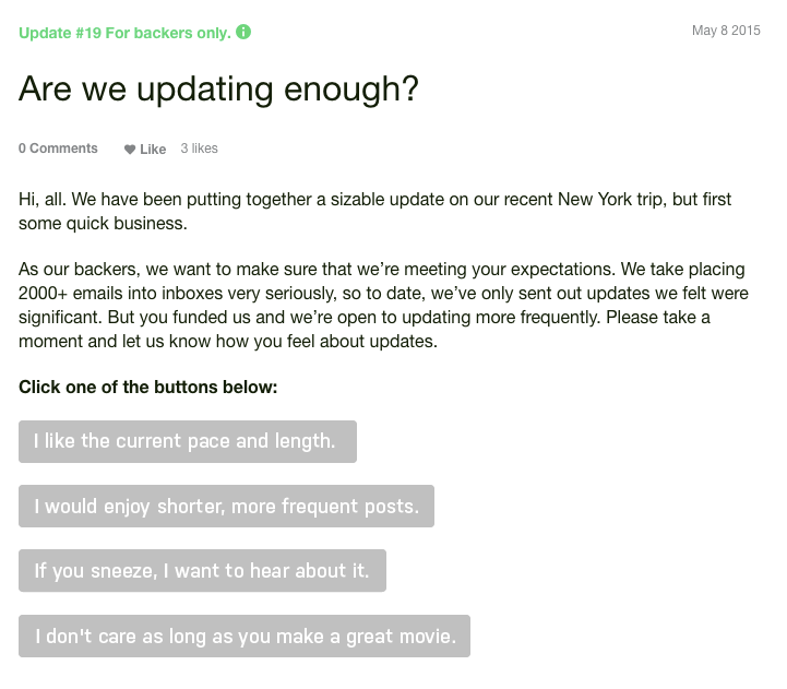
After receiving a few snarky tweets and comments on our Kickstarter campaign, Jake and I decided we wanted to survey our backers to make sure that the majority was pleased with the frequency of our updates. Funnily enough, our best way to conduct the survey was by embedding it in a Kickstarter update.

Most online survey services let you build your survey, and then give you a snippet of HTML to embed the survey on a web page of your choosing. Unfortunately (though understandably), Kickstarter won't let you embed HTML or JavaScript in updates. This meant that the best we could do would be to put a link to the survey in our Kickstarter update. Our backers would need to click the link to go to the survey's page, wait for that page to load, and then choose their answer—a crumby experience that would result in fewer responses. Jake and I agreed that we wanted our backers to see the survey questions right there in the update, click their answer, and be done.

After some consideration, we came up with the idea of embedding one image in the update for each survey answer. Each of these images would be a link to a unique URL. Each time the unique URL for each image was accessed, we would tally a vote. I evaluated several survey tools hoping to find one that supported such a setup, but found none. Add to that, they all had a limit of 100-250 responses in the free tier, and we're on an indie budget. So my next thought was to write a little database-backed web app to accomplish the task. It seemed straightforward enough, but, admittedly, such little projects have a tendency to take me 5-10 times longer than I originally anticipated. As is Jake's talent, he came up with the much simpler idea of abusing Google Analytics to tally the votes instead.

How we did it

Considering that Google Analytics (hereafter GA) is a tool for counting page views, it's a perfect fit for this purpose. And it turns out that GA has a specific feature that makes it even more well-suited: ad campaign tracking.

One use case for ad campaign tracking is making it simple for marketers to distribute multiple versions of an ad and see which one performs the best. We realized we could bend this feature to our will. Rather than making an ad with multiple versions, we would make a survey with multiple answers.

Step-by-step

Here's how to make your own.

  1. Add a new page to your site that will function as the survey's "thanks for answering" page. Ours is just a simple, static HTML page.
  2. Use Google's URL Builder Form to construct your URLs. Fill out the form thusly:
    • Website URL: the URL of your "thanks for answering" page
    • Campaign Source: doesn't matter, just put something in here
    • Campaign Medium: doesn't matter, just put something in here
    • Campaign Content: the title of one of your survey answers
    • Campaign Name: the name of your survey
  3. Repeat step two for each one of your survey answers and save the generated links.
  4. Put the links somewhere that people can find them. Again, in our case, we embedded them as image links in a Kickstarter update.
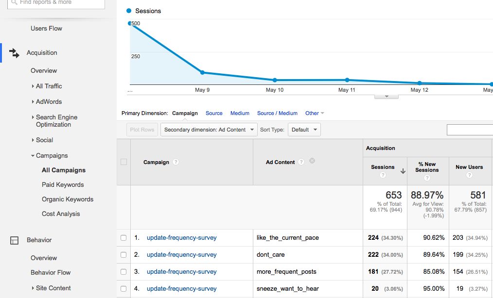
  5. Wait 24 hours for GA to update, then go to the GA dashboard for your website and drill down to Acquisition -> Campaigns -> All Campaigns. You should see your survey name listed here. To see the tally for each answer, you need to click Secondary Dimension -> Advertising -> Ad Content. The Sessions column contains the tally (note: see caveat in last paragraph).

Here's how our survey turned out:

Backery Survey

And the tally from GA:

Survey Results

Of course, this little hack has some limitations. You can only create multiple choice surveys, and you're not protected from someone trying to intentionally game the survey (e.g. voting a thousand times by following the same link repeatedly). But it was good enough for our specific purpose, was free, and placed no limitation on the number of responses. Another nice bonus in our case is that Kickstarter emails updates to backers, and the survey worked just as well from email clients.

Thanks for reading. Please check out the store if you are interested in watching the film.

Getting Your Nebula 4000 Production Ready

Posted by Jake on June 26, 2015

Gimbal shots, when used tastefully, can add a lot of production value to a doc. In the last year, small brushless gimbals have evolved to the point where they can fly a camera the size of Sony’s a7s. At the end of last year, mostly for tax purposes, we invested a couple hundred dollars in a Nebula 4000. It’s a pistol grip gimbal with a small footprint—ideal for fitting in a pelican case where space and weight are issues.

We added some simple modifications to our Nebula so it fits our workflow and we thought documenting it could help some other shooters.

The first two might be universal for gimbals and the second two are more Nebula specific.

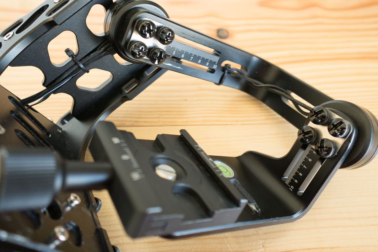
Thumbscrews

We came across this idea from Jason Wingrove on Twitter. Adjusting gimbals can take forever and replacing critical screws with thumbscrews allows for quick, tool-less adjustments.

Thumb Screws

Thumb Screws Close-Up

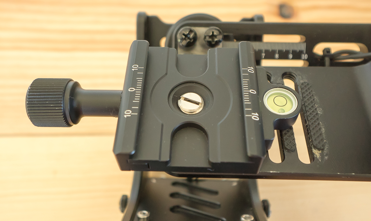
Quick release

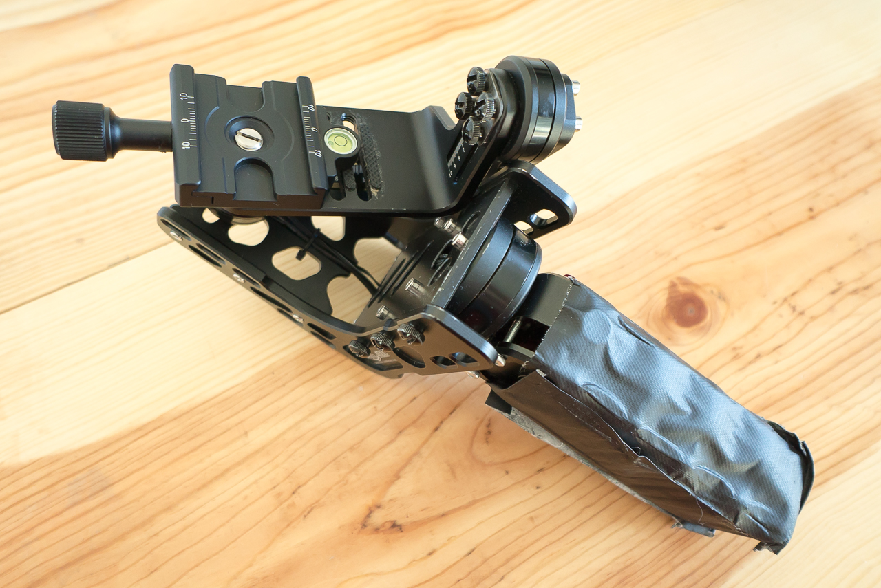
While shooting for the doc, our camera support needs change often and quickly. It took a while to find, but Sunwayfoto makes light and low profile quick release that we could use it with the Nebula 4000. Now our a7s can quickly move between all the pieces of kit that have an Arca quick release and can be connected and balanced on the Nebula very quickly. Here are links to the quick release and plate we're using:

Sunwayfoto 50mm Screw Knob Clamp

Sunwayfoto 26mm QR Plate

Nebula with quick release

Battery modification

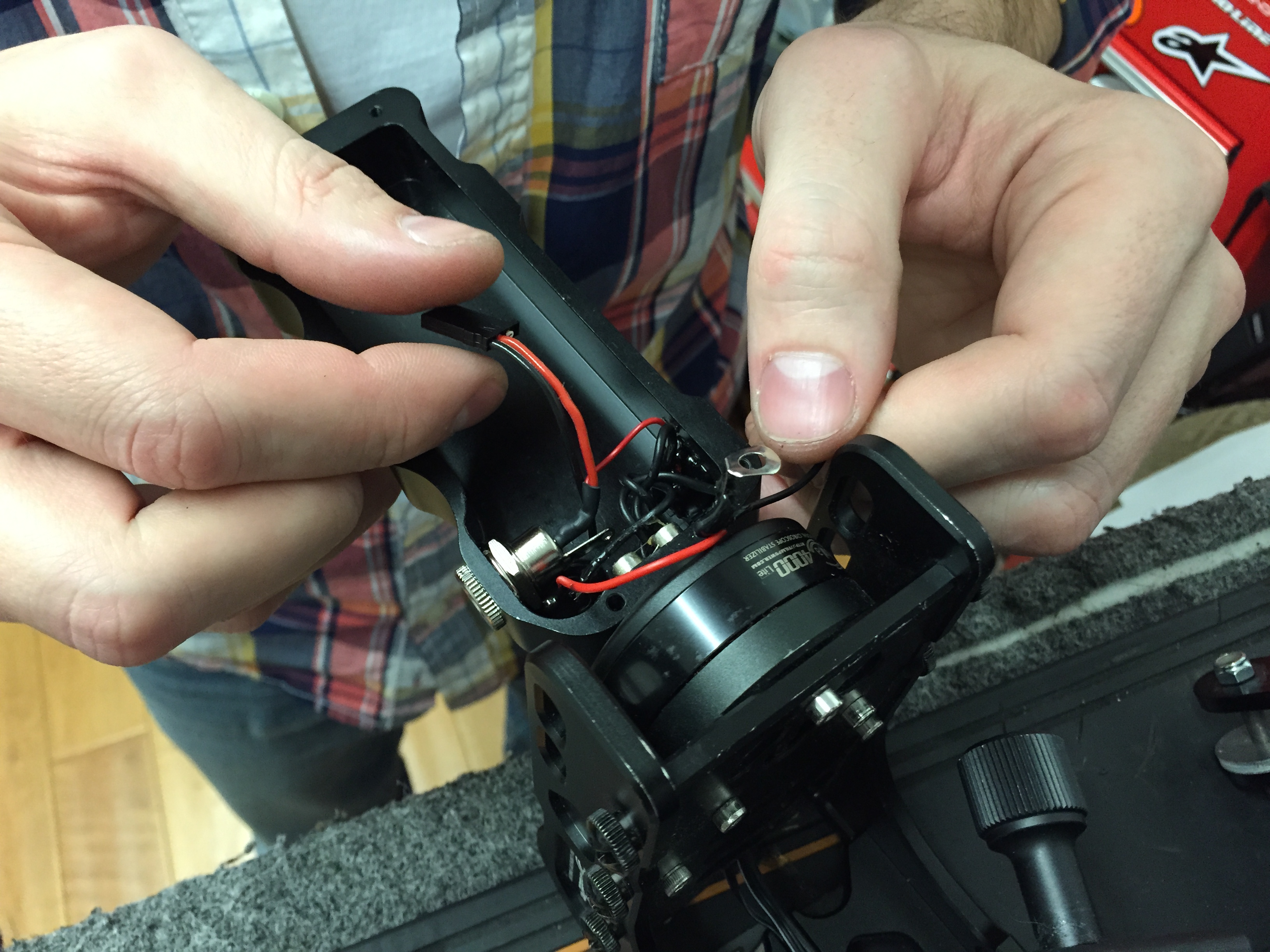
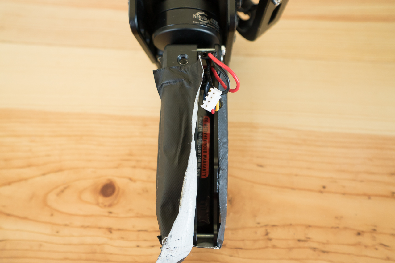
Our charging cable for the Nebula was bent in a Pelican case and it eventually broke the charging port. While getting it fixed at the local RC Hobby shop, we spotted some larger LiPo batteries and decided to super charge our Nebula. The design of the Nebula lends itself well to larger batteries, whereas it may not be an option with other gimbals. We can now go for days between charges, which is great.

Note: Opening your Nebula and cutting wires is not likely to be kind to your warranty.

Battery Mod In Progress

Battery Mod

Padding

From an ergonomic perspective, the Nebula's fit and finish leave much to be desired. The hard edges dig into one's palm and fingers and make long shoots uncomfortable. So, as a finishing touch, we gaffer taped foam weather stripping around the handle. The gimbal is much uglier now, and far more comfortable to hold.

Final

Thanks for reading. Please check out the store if you are interested in watching the film.

New Short & KS Update - App Camp For Girls 3.0

Posted by Jed & Jake on June 25, 2015

Read the Kickstarter update here.

Schiller Showed Up!

Posted by Jake on June 22, 2015

Last year, we had a serendipitous moment meeting John Gruber and his wife Amy Jane at Mezzanine moments before they found out that the team covering the video production side of the live taping of The Talk Show had fallen though. John, having noticed our cameras, asked us if we could do him a favor. We both had a strong drink and went for it and it turned out really fun.

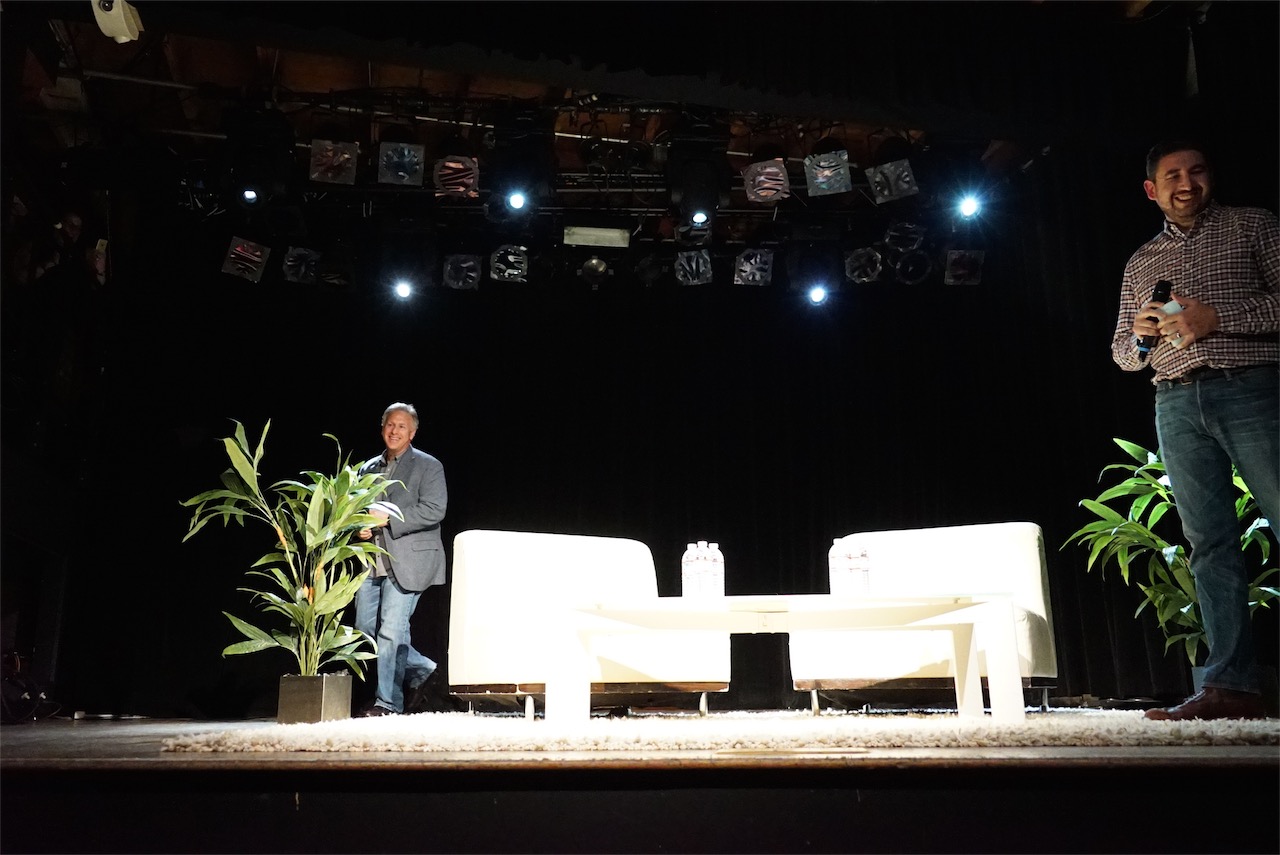
This year we wanted to build on the production value and audience reach, so we pitched John the idea of having a live feed. He thought it would be a fun surprise for the listeners of The Talk Show who couldn’t make it to the event, so he green lit it. We teamed up with our friends Drew and Martin from Hybrid Events Group and had a good time shooting. Despite what some drunk guy shouted out at the end of the event, the feed stayed rock solid. Being there shooting felt a bit serendipitous yet again when John surprised everyone by bringing on Phil Schiller as the guest for the evening.

phil intro

It was an unreal moment, masterfully pulled off. Phil had the idea to not immediately come out when Gruber introduced him and it played out so well.

The interview was great. John and Phil shared light jabs and talked through some of the issues facing Apple. As much fun as we had being there, it was even more fun to watch people like Steven Frank and Marco Arment just soaking it in with smiles on their faces. In many ways and for many people, it seems that the interview confirmed what the development community has long been hoping: that at the very least, Apple has been listening.

phil and john

If you don’t follow Apple, it’s hard grasp how out-of-the-norm this is. It has us hoping that there will be more unscripted, human interactions with Apple executives as we move into a new era of Apple PR. We’re not sure how it could happen, but we think the film will feel incomplete without an interview from Jony Ive since he’s now in charge of both software and hardware. If you can you make any introductions, we would be incredibly grateful.

A huge thanks to John for letting us try something new and fun. A special thanks to everyone involved: Phil Schiller, Merlin Mann, Adam Lisagor, Amy Jane Gruber, Paul Kafasis, Caleb Sexton, and Hybrid Events Group.

The Talk Show Live From WWDC 2015 from John Gruber on Vimeo.

Thanks to Marco Arment for the great photos in this post. We loaned him one of our cameras and you can see more of his pics and his reaction to the night here.

Thanks for reading. Please check out the store if you are interested in watching the film.

KS Update - Backer Survey Results, New York Trip, WWDC 2015

Posted by Jake & Jed on May 27, 2015

How Drobo is Helping Us Make a Film

Posted by Jed & Jake on May 20, 2015

During our Kickstarter campaign last year, Jean MacDonald of App Camp For Girls fame kindly put us in touch with Mark Fuccio who was consulting for Connected Data Inc., makers of Transporter. Mark became a friend of the project and generously offered to use his ties to Drobo and Transporter to help us out with some gear needed for making the film. His only request was that we share with you all how we were able to put it to use.

We have a few challenges to solve as Jake is based out of Long Beach, California and Jed is based out of Twin Falls, Idaho. We share editing duties, so we each need to have all of our footage locally. Our other obvious challenge is that we have a ton of data and any amount of data loss could spell the end of our endeavour.

Our Workflow

Here’s how we put our workflow together:

  • Mark had Drobo send us each a Drobo USB 3.0 as well as a pair of Transporters each (think of Transporter as a private alternative to Dropbox). The Drobos have four drive bays and we filled ours with 3TB drives. We configured our Drobos to use one drive for redundancy, so we ended up with about 9TB of storage each. We currently have over five terabytes of footage, and it is reassuring to know it’s all stored on a system that protects from drive failure with space to spare.
  • All of the footage we shoot goes onto each of our Drobos. We manually keep them in sync (e.g. ensuring that all footage goes into identically named folders on each Drobo).
  • When we travel together for a shoot, we each carry a 1TB notebook drive. We ingest to each of our drives at the end of each day. This provides redundancy as well as enabling us to go our separate ways at the end of the trip—each with a replica of the new footage. We then copy the footage to each of our Drobos when we get home.
  • When one of us shoots footage alone, we use our Transporters to shuttle the footage to the other. The Transporters work wonderfully for shuttling large files (versus Dropbox) as they connect directly to our networks and are always on, obviating the need to leave our computers on for days. Once the footage from a shoot has been successfully synced via our Transporters, we archive it to our Drobos.

Ease of Mind and Use

Surprisingly, we’ve actually had two hard drives go bad since we started using our Drobos. In both cases, we simply pulled the bad drive out, RMA’d it, and popped in the replacement when it arrived. The Drobos assimilated the new drives without skipping a beat. Our Drobos took something that could have been absolutely devastating to the film (a drive failure) and turned it into a minor inconvenience (mailing in a bad drive for a replacement). Ease of use and reliability are two of Drobo’s biggest marketing points, and we can attest that they’ve done well here. As an aside, we told Mark about our struggles with bad drives and he informed us that Seagate drives (which we’re using) have measurably higher failure rates than Western Digital and HGST. Something to keep in mind if you’re in the market for hard drives.

Editing Footage Directly from the Drobos

One of our primary concerns in basing our editing workflow off of the Drobos was that they wouldn’t be able to keep up. Our conclusion so far is that our fears were unfounded. We have completed a handful of edits from the Drobos and don’t have any complaints with regards to performance. The majority of our footage is ProRes (which means large file sizes), so we were pleasantly surprised that our Premiere edits of varying size open and load within 10 to 20 seconds (assuming caches are already built). Once loaded, scrubbing timelines and playing back the edits are nice and smooth.

If you’re looking for raw numbers, we get around 220MB/s read, 200MB/s write speeds using Blackmagic Disk Speed Test, which is measurably better than our single platter drives, and (obviously) measurably worse than our SSDs. But of course, who can afford to put together a redundant, 9 terabyte SSD array? (If you can, and you’d like to give us two, please get in touch).

The Drobo may not win performance benchmarks, but it’s fast enough for us and we can’t fault Drobo for their focus on safety and ease of use over performance.

Conclusion

We’re (for the most part) a two-man show, so it’s vital to make the most of our time. We don’t want to spend it worrying about how our footage is stored and whether it’s safe. We just want a couple of gigantic, redundant, decently-performing volumes that will let us get our job done, as well as a convenient way to shuttle huge files between the two of us when the need arises. The Drobo+Transporter combo touches on each point beautifully. So, thanks to Mark and the folks at Transporter and Drobo!

A Few of Our Favorite Tools

Posted by Jed on January 16, 2015

We all use a lot of tools on a daily basis to complete our work and Jake and I have always been fanatical about ours. We suppose it's something that many creatives hold in common.

Here are a couple of the tools we've come to love and depend on, especially for creating App.

Task Management

Asana

I've tried more than a few task management tools over the years—OmniFocus, Things, Basecamp, Wunderlist, Taskpaper, Taskwarrior, text files + Vim. A lot of them.

When working by myself, I still have a soft spot for the simplicity of plain old text files. But unfortunately, they don't scale well to a team environment.

Around 2008 or so, I remember watching Justin Rosenstein's video introducing the thinking behind his new startup, Asana. I was intrigued by Justin's philosophy on collaboration and signed up for a beta. I've been using Asana ever since. Here are my two big reasons:

  1. Asana is built around a simple text editor metaphor. Press the enter key to create a new task. Use cmd+up/down to re-order tasks (a common keyboard shortcut in text editors). You can even paste a multi-line list from a text editor into Asana and it will make tasks out of each line. This made me feel right at home coming from a preference of managing tasks with a text editor.

  2. The keyboard is my favorite. The mouse, not so much. I try to do as much work as possible with my keyboard. I'm a huge fan of Quicksilver, Shortcat, OS X's Keyboard -> Shortcuts pref pane, and generally any piece of software that can be completely operated with a keyboard. Other than Gmail, Asana is the only web app I've used that can be used solely with a keyboard. It's a beautiful thing.

In my opinion, Asana accomplishes an elegant blend of these two killer features in a way that no other collaborative task manager has quite pulled off. Jake and I love it.

Disclaimer: Asana generously sponsored our project during our Kickstarter campaign, but like I said, we've been fans since before it was cool.

Chat

Slack

It's all the rage these days. After our friend Adam's company fell in love with and made a video for it, we knew we had to give it a try. Jake and I had been relying solely on Messages.app prior. Slack's integrations with services like Asana, Google Docs, Dropbox, et al and its fully searchable history have been big boons to our communication. Though we do still use Messages.app for friendship stuff and, occasionally, things that are urgent.

Screen Sharing

Screenhero

Jake lives in Long Beach. I live in Twin Falls, Idaho. Thus, we need a good screen sharing app when we're working on edits and various other tasks. As with task managers, I've used a number of these over the years—*VNC, LogMeIn, TeamViewer, Google Hangouts, and likely several others I can't recall.

I discovered Screenhero soon after they launched their public beta. I was intrigued by the promise of multiple, simultaneous input from each participant and decided to give it a try. Though the beta was quite crash-prone, the team did a stellar job of polishing things before the 1.0. Jake and I are now happy, paying customers.

While the multiple-mouse-cursor feature has come to feel obvious and right, here's the killer feature for us: we are able to do full-screen (Thunderbolt display, 2560x1440 resolution) sharing at a comfortable 24 frames per second. Which is perfect when Jake and I are editing our 24fps footage together. Of all the screen sharing apps I've tried, Screenhero is the only one that gave me this kind of performance. It's certainly possible that others have caught up since I tried them, but we've settled on Screenhero for the foreseeable future.

Thanks for reading. Please check out the store if you are interested in watching the film.

Neven Mrgan on Why Skeuomorphism Is Like a Classic Car

Posted by Jake & Jed on January 8, 2015

2014 was a banner year for our project and its passing neatly coincides with us moving into a new stage of the project.

In 2015, look forward to us ramping up our sharing of photos, outtakes, blog post, and videos on a more frequent basis as we move towards the release of the film.

In fact, here’s a little ditty to whet your whistle.

We could sit and listen to Neven talk forever. Like so many of our interviewees, the guy has insight for days and the work to back it up. We knew this gem in particular would be a great addition to the ongoing conversation around design aesthetic. So we’re letting it fly the nest early for your enjoyment.

For us, this was a great chance to work out the look, feel, and pacing we’re striving for with the film. It also gave us a chance to work with our talented composer Enoch Kim.

Let us know what you think.

Much Love,

Jake & Jed
@appdocu

Video Credits:
Featuring: Neven Mrgan
Apps featured: 76 Synthesizer, doubleTwist Alarm Clock, and Tweetbot
Videos featured: Material Design - ©Google, 1980 Toyota Corolla - ©Toyota
Special Thanks: Rod McSweeney and Panic
Musical Score By: Enoch Kim


Some design will always be great.

A photo posted by Story & Pixel (@storyandpixel) on

Thanks for reading. Please check out the store if you are interested in watching the film.

Kickstarter Postmortem - Part 2

Posted by Jed & Jake on November 26, 2014

Continuing our three part series of lessons we learned from our Kickstarter project, let’s dive in to part 2 - During Campaign.

Don’t fear the middle

Here’s one you’ll hear a lot, but it’s really hard to believe when you’re in the middle of it, so let us say it again: Don’t expect much to happen in the middle of your campaign. We made it to $30k within the first 24 hours. We then grew matching ulcers as the firehouse died down to a trickle. It took us another 21 days to bring in the next $30k.

There is this distinct moment we remember when we were just a few days away from the deadline and looking at this insurmountable wall of $40k to go, knowing that it had taken everything in us to raise the last $30k. Then something magical happened. Just as everyone who had been there before had predicted, we saw a large spike at the end of the campaign and blew past our goal—all thanks to the efforts of our backers. If you’ve laid the groundwork, if you’ve connected with people and inspired them with your idea, they will be there at the end to carry you over the line and beyond.

We’re glad we did the work to grind out that middle $30k, but in retrospect the work would have been much more enjoyable without the impending sense of doom and futility that accompanied it. If you are fortunate enough to have a strong launch, run a good campaign knowing that there’s some help waiting for you at the end of the marathon.  

Websites like Kickspy and Sidekick can also do much to allay fears during the mid-campaign slump.

Big Media Is Not Your Only Hope

We were very excited to receive coverage from some major news outlets throughout our campaign. But the data proves out that the majority of our funding came from word of mouth via Twitter and independent blogs. The larger outlets have a lot of eyeballs (which certainly helps) but the indie bloggers have a dedicated audience. An example: as development blogs go, Furbo.org is not one of the largest, but when Craig Hockenberry wrote about what the project meant to him, his readers got on board wholeheartedly.

Never count the indies out.

Press Releases are Hard

If you’ve never written a press release, be warned, they’re tough. We took a few days trying to write a usable one. We were really fortunate that some friends at the Silver Telegram extend their help with its composition and send it out to their email list of tech reporters resulting in a story on Engadget.  

Overall, press releases are hard to write because they’re not formatted in normal human communication. Pair this with media outlets relying less and less on them for stories and in our limited opinion they’re not really worth your time.  

On the flip side, there was a tinge of nostalgia as we posted our press release to PRmac knowing that so many great creators in the Mac space had gone before us.

Not all interested reporters are very interested

Over the course of the campaign, we received a number of inquiries from tech journalists asking to interview us. We spent many hours gathering content, replying to emails, and talking on the phone. Of the several reporters who engaged us, only one or two wrote a story on the project. That’s not to say that the time wasn’t well spent. But we thought it worth sharing. If you’re otherwise swamped, it may be worthwhile to vet the seriousness of the inquiries before you spend a lot of time replying to interview questions.

Embrace super backers

A handful of backers contacted us early on in the campaign to express their excitement about the project and willingness to help out in any way they could. These super backers offered advice and encouragement throughout the campaign, and also helped get the word out. We're still very thankful for them. If you're fortunate enough to get some super backers, do everything you can to empower and embrace them.

Make compelling upgrade rewards (put people within $5-$10 of the next reward)

We got a lot of backers at the $25 level, which was expected as that's the most common pledge on Kickstarter. However, we realized that if we could offer something of sufficient value, many of the $25 backers may be willing to increase their pledge. We added a $15 upgrade reward. This worked out well because it put the $25 backers at $40—just $10 away from the $50 reward level. As a result, we saw many people jump from $25 to $50 to take advantage of the next reward tier. A caution: be sure to reward your backers for digging deep. To thank ours, we started piling on stretch rewards as soon as we could.

Stay human

Run a good, clean campaign. Stay away from gimmicks, which can become very tempting when the end is in sight and you haven’t reached your goal yet. Stick to your values.

Your Kickstarter backers will be with you for a long time. Work hard to make sure they still like you when the journey’s over.

Thanks for reading. Please check out the store if you are interested in watching the film.

Kickstarter Postmortem - Part 1

Posted by Jed & Jake on October 28, 2014

App was our first foray into the world of crowdfunding. At each stage of the campaign, we learned a lot and we want to share our experience. Hopefully it will be helpful for others looking to crowd fund a film. We’ll even share the mistakes we made in hopes that you can avoid them with your project. Don’t miss the last one in this post—it’s a doozie.

We’re doing this in a 3-part series of blog posts, broken into: Pre-Launch, During Campaign, and Post Campaign.

Let’s start with pre-launch.

Polish the idea

Your idea is in your head. To crowdfund it, you need to get it out and help others understand it. We did this by running our idea by friends, family, and pretty much anyone who would listen so we could gauge their reaction and interest level. It’s amazing how quickly your explanation of the project can improve by simply trying to explain it to other people.

Get buy-in

Our film is a documentary and so we needed to get busy, talented people to let us film them. Our approach was multifaceted but it all stemmed from email in some way or another.

We knew the people we were contacting were busy and were most likely being pitched something in one way our another on a regular basis. So we kept our pitch email short, fun, and transparent. We also sweated our grammar as in many cases this email was our first interaction with potential interviewees and we wanted to be taken seriously and appear trustworthy of their time.

Some interviewees were kind enough to make introductions on our behalf but the bulk of the interviews we landed happened over email.

Research

There are some great books, posts, and classes that you can find on-line. Take any advice from people who are “hacking” Kickstarter with a grain of salt. If your goal is to leverage every friend, family member, and acquaintance you have for the sake of your project, you’re a terrible person.

Pick your platform

Crowdfunding is exploding and there are various sites each with their own advantages. For us, the decision was pretty easy. We chose Kickstarter because it was a household name and we knew our project had the potential to be a high profile campaign with a wide reach. This bet paid off and the people we came in contact with from Kickstarter were so encouraging and great to work with.

Take your time laying the groundwork

Don’t launch until you’re ready.

For many, a Kickstarter campaign represents a coming out to the world. It is thus a weighty thing. Take it seriously. Many of the people you want to reach with your product will remember you (or not) based on this first point of contact.

We began working on our Kickstarter campaign a full year before we launched it. We initially set a goal to launch the campaign a couple of months after our first conversation on the matter. The deadline came and went as we both recognized that our teaser was nowhere near the level of polish we wanted.

We launched several months later, after 20 cuts of the teaser, a number of trips to capture interviews, and countless emails and conversations asking for feedback and advice—both of which were heaped on us in abundance, for which we’re forever grateful.

All of that hard work paid off before we even launched. It gave us the assurance that even if our campaign failed, we could be content knowing that we truly tried our best. Conversely, how tragic it would have been to have failed knowing that we half-assed it.

Don’t be afraid to buck convention

As a general rule, Kickstarter pitch videos should start with the pitch. Makes sense. However, that approach didn’t sit well for us. We had invested massive effort in polishing the teaser; it was by far our strongest asset. So in the interest of letting the work speak for itself, we decided to lead with the teaser and put the pitch at the end. We’re much more at home behind the camera so we kept the pitch section of the video as short and simple as we could get away with.

Obviously, we can’t say with certainty that this decision made our campaign more successful, but our campaign was a success and we received a ton of glowing feedback on our Kickstarter video. Go with your gut.

Rewards: look for assets you’re already creating

Rewards. This is a tricky one. As a creator, you want your rewards to be compelling, surprising, and delightful. All laudable characteristics. However, it’s easy to fall into the trap of over-promising—spreading yourself so thin that there’s little energy left to work on the thing you wanted to make in the first place.

Here’s our advice: as much as possible, keep your rewards within the scope of the product and natural by-products of your project. Here’s an example from ours:

We discussed rewards ad nauseam and eventually hit on the idea of “App Stories”. We would offer the full interviews, nearly uncut, of all interviewees. This idea gave us a way to preserve much of what would have otherwise hit the cutting room floor, as well as a way to fill in the large gap between the $35 deluxe film reward and the sponsorship level rewards. Best of all, much of the work in fulfilling the App Stories rewards would be completed as a by-product of making the film.

The anti-example from our project being t-shirts. Damn. T. Shirts. (More on that in a future post.)

Have video content ready to go

We heard this a few times, but didn’t make it a very high priority. If you get early buzz, having fresh content can help you sustain that buzz. We also learned that reporters and bloggers are really interested in exclusive content. Once you have some coverage, no one wants to re-write the same story that’s already on other sites. Give them something fresh.

Rewards: Consider making some things optional.

While planning the rewards, we held the conviction that anyone backing the project would only do so because we were offering a good deal.

But in speaking with a number of our backers, we learned that the vast majority of them simply believed in the project and wanted to see it made—some to the tune of thousands of dollars. What a humbling, touching experience.

The takeaway was that we promised a few things in our rewards that we could have made optional. Things that our generous backers didn’t really care about and that didn’t factor into the decision to pledge. Some people just want to give you money.

Be careful with exclusive rewards

We made our premiere tickets exclusive to Kickstarter and didn’t come close to selling out. We’ll obviously need to sell more tickets to our premieres, and then come up with an extra perk for those who bought premiere tickets during the campaign. Lesson learned: make sure exclusive rewards won’t bite you in the ass if things don’t pan out the way you’re hoping.

Amazon setup takes a while

Kickstarter does a good job of communicating this, but we still ended up cutting it uncomfortably close. So we’ll say it again here: Get your business checking account and Amazon Payments account set up well before the launch date of your campaign. It took us about 3 weeks to complete the process, the last couple days of which were needlessly stressful.

Amazon can take up to three weeks to release funds

This one took us by surprise. It took a full 21 days from campaign end to money in the bank. The first 14 days was for Amazon’s review process. Apparently, when a brand new account takes in $160k in a single day, they like to perform some due diligence. No idea why. The last 7 days was the waiting period for the wire transfer process. And even then, Amazon still withheld a few thousand dollars in case they needed to honor their customer return guarantees (we suspect this has little applicability to Kickstarter funds, but ok).

We ended up putting a bunch of money on credit cards so we could shoot during the waiting period. Thankfully, we received the funds in time to pay the cards back down without interest, so no harm done in our case.

However, in our Internet wanderings, we came across myriad horror stories where creators promised delivery of rewards 30 days after campaign end, and received their funds about 25 days after campaign end. We assume much sleep was lost.

Consider Forming an LLC

Even if you’re going solo, you might want to consider an LLC to protect your personal assets should things go awry. The ethos of Kickstarter is fun and creative but you’re still entering into a legal agreement so go in with eyes wide open. We used Legal Zoom to set up our company.

Plan your tax year. Budget for taxes.

Our campaign ended July 31st, 2014. We budgeted the money to last through 2015, but the IRS can’t be bothered to consider that. Since we made the money in 2014, whatever we don’t spend in 2014 is considered taxable profit. Which could potentially be many, many thousands of dollars.

Our advice: make your campaign end on January 1st, and simply spend all of the money you make by December 31st. That’s all we got. If you have any other ideas, please let us know (seriously).

Thanks for reading. Please check out the store if you are interested in watching the film.

How to automatically scroll a web page for buttery smooth screen captures

Posted by Jed on October 14, 2014

This is a fun one.

Jake and I have been making promo videos for our corporate sponsors over the past few weeks. With each video, we’ve faced the problem of capturing the sponsor’s website in an elegant way. We both like the effect of a slowly scrolling web page.

To achieve this effect, one would conventionally capture a screenshot of the web page and use a compositing suite to animate the scrolling effect. But this approach requires also compositing the mouse pointer and any buttons that change state. We're trying to finish these videos quickly to get back to the film, so minimizing post work is a top priority. We decided to try a live screen capture of a browser instead.

We launched our screen capture app (QuickTime Player X in this case), navigated to the page we wanted to capture, started the capture, and scrolled down. We quickly realized that using one’s fingers on a trackpad to scroll a web page results in a video reminiscent of using one’s fingers on a trackpad to scroll a web page. Not so elegant. So our next thought: Let’s automate the scrolling.

By injecting a bit of JavaScript into the page, we were able to capture the precise effect we were after. Here’s the code we used for our latest video:

var scrollElement = function (element, scrollPosition, duration) {
  var style = element.style;

  // setup CSS transition duration and easing function
  style.webkitTransition =
        style.transition = duration + 's';
  style.webkitTransitionTimingFunction =
        style.TransitionTimingFunction = 'ease-in-out';

  // use translate3d to force hardware acceleration
  style.webkitTransform =
        style.Transform = 'translate3d(0, ' + -scrollPosition + 'px, 0)';
}

var scrollBody = scrollElement.bind(null,
                                    document.getElementsByTagName('body')[0]);

The above code performs the scrolling using a hardware accelerated CSS transform (in layman's terms: it’s buttery smooth). Result: a nice ease-in-out effect adhering to the scroll distance and duration specified, while keeping in tact the mouse pointer, button states, and animated elements.

Wanna try it? To make it easy for you, we've fleshed out the code and created a bookmarklet: AutoScroll (click that button to try it on this page).

To install the bookmarklet, just drag the button above to your bookmarks bar, navigate to the page you’re capturing, and click it.

Oh yeah, you can also specify a delay before the scrolling starts, allowing for last-second prep (like hiding the bookmarks bar).

We hope you find this little tool useful! You can see it in action in the UserTesting video we released this week:

Thanks for reading. Please check out the store if you are interested in watching the film.

Welcome!

Posted by Jed on October 7, 2014

Hello and welcome to our new blog! We’re excited to have a permanent home for our writing and to share our process more in-depth—docs we’re watching and analyzing, news we’re reading, people we're talking to, potential plot-lines and angles we're discussing, etcetera. We’re also looking forward to writing about some of the technical challenges we’re facing and the solutions we have devised.

For those of you following our updates on Kickstarter, you may of course continue to do so. We will continue posting notable milestones there. However, if you'd like more frequent and in-depth posts, you'll find them here.

Subscribe to our RSS feed to stay up to date. Also, we'll tweet any time we post, if that's more your flavor.

RSS Feed

Archive

Los Angeles Premiere Nov 16th 04 Nov

Twin Falls Premiere Nov 5th 30 Oct

2016

Jake & Jed's Renderbeast 30 Sep

KS Update - Nearing completion. Looking for help with finishing costs. 19 Jul

KS Update - Subtitles now available for rough cut 05 Jul

KS Update - Wrapping up June 29 Jun

KS Update - Counting down to June 23 May

The App Behind App - Part 3 22 Apr

KS Update - June 12 Apr

The App Behind App - Part 2 15 Feb

2015

The App Behind App - Part 1 29 Dec

T-Shirt Orders are Open for the Next Week 19 Nov

We're Missing Our Estimated Ship Date 17 Nov

XOXO Rough Cut Online Premiere - Our First Crack at the Opening of App 08 Nov

Sebastiaan de With on Coming Back to Design 30 Oct

Björn Jeffery, Ken Wong, and John Gruber on the Profundity of the Touch Interface 22 Oct

Jake Lodwick and Heather Buletti on How Apps Can Make Us Superhuman 16 Oct

Matías Duarte on How Apps Are Like Magic Spells 09 Oct

KS Update - XOXO Festival Premiere & Upcoming Online Release Details 22 Aug

KS Update - Portland-Seattle Trip Summary & Upcoming Events 20 Aug

KS Update - Edit Sprints, Panic, and our own App?! 27 Jul

Abuse Google Analytics to Make Free Surveys 10 Jul

Getting Your Nebula 4000 Production Ready 26 Jun

New Short & KS Update - App Camp For Girls 3.0 25 Jun

Schiller Showed Up! 22 Jun

KS Update - Backer Survey Results, New York Trip, WWDC 2015 27 May

How Drobo is Helping Us Make a Film 20 May

A Few of Our Favorite Tools 16 Jan

Neven Mrgan on Why Skeuomorphism Is Like a Classic Car 08 Jan

2014

Kickstarter Postmortem - Part 2 26 Nov

Kickstarter Postmortem - Part 1 28 Oct

How to automatically scroll a web page for buttery smooth screen captures 14 Oct

Welcome! 07 Oct